Ian Rogers, Montreal graphic designer and owner of the brilliant art blog Grey Not Grey is doing the cover for my upcoming release “Industrial Revolution”.
Ian has instructed me to tell you that these are “very, very rough, the equivalent of a digital ‘napkin sketch'” so, yeah, keep that in mind.
You have to take my word for the fact that they are all very relevant to the story in their own ways.
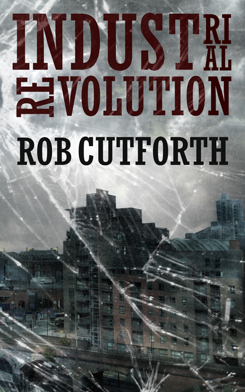
Number 1: Grey skies and broken glass
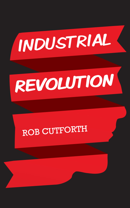
Number 2: Face in ribbons
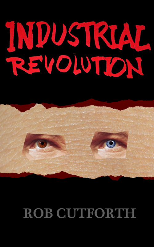
Number 3: Creepy eyes!
I have polled my friends and family and one of them was a clear winner. See if you can guess which one.
Favourite comment so far: What kind of author name is ‘Rob Cutforth’?! ‘Steve’ King wouldn’t have cut it, change it to ‘Robert’ or ‘RT’. Yes ma’am.